HubSpot CMS and Accessibility: 5 Tips for Making Your Site Accessible
Creating a website that is accessible to all users is not only a legal requirement, but it is also an ethical obligation. It is essential to ensure that your website is accessible to everyone, including people with disabilities.
In this blog post, we'll try to explore some tips for making your HubSpot CMS site accessible.
Use Alternative Text for Images
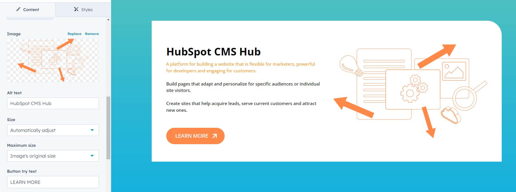
Alternative text (alt text) is a short description of an image that is read aloud by screen readers for visually impaired users. It is essential to provide accurate and descriptive alt text for all images on your website to make it accessible. HubSpot CMS makes it easy to add alt text to your images by simply filling in the 'Alt text' field in the image editor.

Use Descriptive Headings
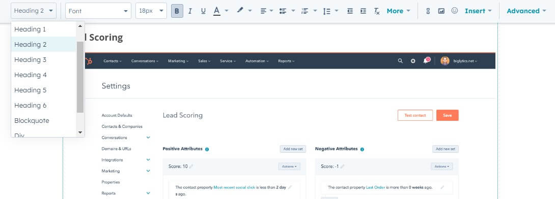
Headings are an essential part of any website's structure, as they help users understand the content hierarchy. Use descriptive headings to make it easier for users to navigate your website, especially for those who use screen readers. HubSpot CMS offers several heading options, and you can also customize the styling to suit your brand's guidelines.

Ensure Color Contrast
Ensure that your website's colors have enough contrast, so they are easy to read for users with visual impairments. HubSpot CMS allows you to customize your site's colors, but it's essential to ensure that the contrast ratio is at least 4.5:1 for text and 3:1 for large text or user interface components.
For example - contrast ratio for black color (#000 or rgb(0,0,0)) to the white (#fff or rgb(255,255,255)) is 21.
To check your site colors contrast rations you can use any online tool, for example WebAIM Contrast Checker (give possibility to check contast for the colors) or Experte Contrast Checker (this one can give recomendation for each element of your exact webpage).
Use Descriptive Link Text
Use descriptive link text that tells users where the link will take them. I know, that this is not allways possible, but try to avoid using generic text like "click here", which is not helpful for users with disabilities who use screen readers.
Instead, use descriptive phrases that convey the purpose of the link, such as "Download our accessibility guide".
Test for Accessibility
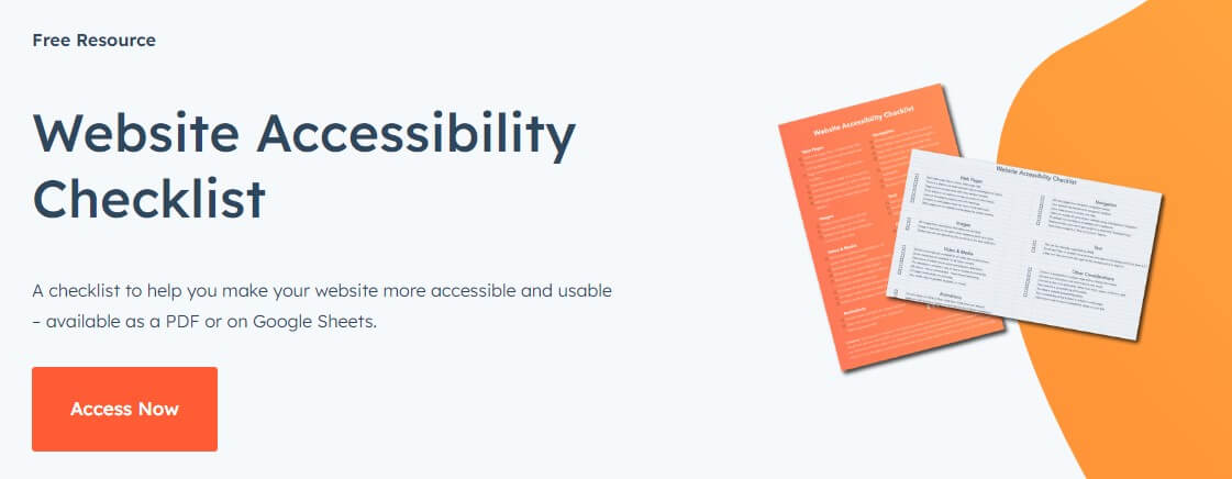
Finally, it's essential to test your website's accessibility regularly. You can use any accessability checklist, or took the one provided by HubSpot. Use it to identify any issues that need to be fixed and ensure that your website is accessible to all users. HubSpot CMS provides quite flexible design tools that allows you to find and fix all the issues quite fast.
Just remember, creating an accessible website is essential for ensuring that your content is available to everyone, including users with disabilities. By following these tips, you can make your HubSpot CMS site more accessible and provide a better user experience for all your visitors.
Plus, as a nice bonus, most of this tips are good for your website SEO.


