Implementing a Design System on HubSpot
In today's digital landscape, creating a consistent and cohesive brand experience across various digital touchpoints is crucial. One effective way to achieve this is by implementing a robust design system. In this blog post, we'll explore the process of implementing a design system on HubSpot, a powerful platform for marketing, sales, and customer service.
What is a Design System?
A Design System is a structured collection of design elements, guidelines, and principles that ensure consistency, efficiency, and coherence in the creation of products or services within an organization. It encompasses a set of reusable components, patterns, style guides, and documentation that establish visual and functional standards.
At its core, a Design System serves as a centralized resource that aids designers, developers, and other stakeholders in maintaining uniformity across various digital or physical products. It includes guidelines for typography, color schemes, iconography, spacing, and interactions, fostering a unified user experience across different platforms or devices. By promoting consistency and scalability, a Design System accelerates the design and development process, facilitates collaboration among teams, and reinforces a brand's identity.
A Design System ensures uniformity across products, accelerates workflows, and improves efficiency by offering reusable components and guidelines. It facilitates team collaboration, reducing inconsistencies and redundancies while scaling products effectively. Ultimately, it strengthens brand recognition, enhancing overall product quality and user satisfaction, ultimately leading to improved user experience and cost savings for the company.
Implementing a Design System offers numerous benefits to companies:
- Consistency: Ensures uniformity in design, leading to a cohesive user experience across all products and platforms.
- Efficiency: Speeds up the design and development process by providing reusable components, patterns, and guidelines, saving time and resources.
- Scalability: Facilitates easy scaling of products or services while maintaining consistency and quality.
- Collaboration: Encourages better collaboration among teams, fostering communication and alignment on design principles and standards.
- Brand Reinforcement: Strengthens brand identity by enforcing consistent visual elements and styles across all touchpoints.
- User Satisfaction: Improves user experience by providing a predictable, intuitive, and coherent interface, enhancing overall satisfaction.
- Maintenance and Updates: Simplifies the maintenance and updates of design elements, ensuring that changes are applied uniformly across the system.
- Cost-effectiveness: Reduces design and development costs by reusing components and streamlining processes.
Steps to Implement a Design System on a platform
1. Assessment and Planning Before diving into implementation, conduct an in-depth assessment:
- Analyze current design elements and identify areas for improvement.
- Define specific goals and objectives for the design system implementation.
2. Creating Design System Assets Build a library of reusable components and establish guidelines:
- Develop a comprehensive set of components (e.g., typography, color palettes, buttons) with clear usage guidelines.
- Document best practices and create a style guide to maintain consistency.
3. Integration with a platform Explore methods to integrate the design system into the platform:
- Utilize customization features and tools to implement the design system seamlessly.
- Develop templates and modules that align with the design system's principles.
4. Testing and Iteration Test and refine the design system for optimal performance:
- Apply the design system to various assets and templates.
- Gather feedback from stakeholders and users to make necessary adjustments.
And the HubSpot CMS is, probably, the best enviroment to implement a Design System.
HubSpot & Design System
In most cases landing pages or a new website pages are created not by the developer, but by the merketer. So it is really important to build the set of the most common website parts and let the marketer use the ready-made solutions. Let's dive deeper into Design System implementation into HubSpot and check it asset by asset.
Fonts and sizes
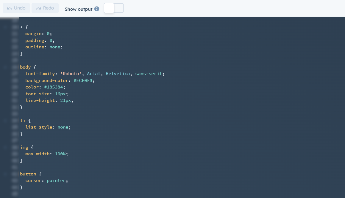
To implement fonts and sizes, best idea, as for me, is build one base.css file, that will be applied to all the template of the project. It have to have inside:
- importing the font (in case you not use the Google Fonts or similar services) and applying to the body/page elements (in case your h1, h2, etc have different font) + don't forget to add Arial, Helvetica or different standard font, that will be loaded in case the main one will not.
- for sure common body styles
- styles for the titles: h1, h2, h3, h4
- styles for the lists (ul, ol) and list items (li)
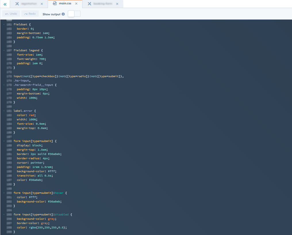
- styles for the forms (fieldsets, different types of inputs, select, textarea, submit button)
- styles for images
- styles for buttons & links + hovers
Simple example from one of the project where all landing pages are doing by the marketers (it is not full css, but the principle is as follows):

or from another project, where there are a lot of forms:

I am fully agree with everybody, who says that styling by tag is not the best practise, but in case when you're doing the system, that will be used by the marketer and pages would be created in DnD editor - this is an optimal way.
Templates, modules and sections
In case you need some more specific, you could build:
- Landing page template with preinstalled sections,
- Create the reusable module that can be used on the multiple landings.
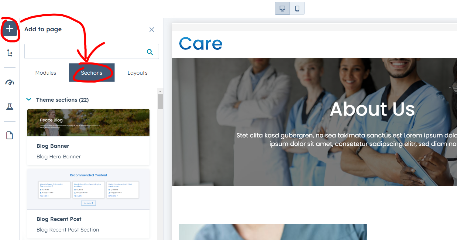
- And another gereat thing that was added to the themes - you could build the section, that can be applied to the different parts of the page (like 3 colums and cta for example, or full hero banner):

on the screenshot - free Care theme by Inboundsys.
Using the templates (even DnD) with prebuild modules and base styles, that as build by your design system, you, as developer, could easily to let go of the reins of the project and save a lot of time/money on building new designs and new landings for marketing experiments.
CTA
The other point of design system are call-to-action buttons. The trouble here is that they are created in different place that other elements and the styles have to be set for each one separately. Good news: in most cases there is enough to build it once and then just copy the styling.
Design system examples
Here are top 3 (as for me) examples of the design systems:
Google Material Design
Material Design started in 2014 and made a lot of other companies want to create their own design styles. It's based on the idea of using materials as a model, so things look and act like objects in the real world. For example, it uses textures, shadows, and how light reflects off objects. The goal is to make things easier for people to understand by making them act like things they're familiar with, which helps reduce how much people have to think when they use them.
Material Design covers a lot of things, like how to pick colors, choose fonts, and create icons. It also includes ready-to-use parts for making interfaces, some of which are free for anyone to use. There are also guides for programmers and other helpful stuff to learn from.
Apple Human Interface Guidelines
Apple’s Human Interface Guidelines are a set of rules for people making apps for Apple devices like iPhones, Macs, watches, and TVs. These guidelines cover different technology areas like augmented reality and HomeKit.
For each device, the guidelines explain how apps should be designed, how users interact with them, what the devices can do, and how they should look. They give detailed advice on how to use each part of the interface and why it's designed that way. The main aim is to make sure that apps on Apple devices feel familiar and work the same way for everyone who uses them.
There's also a big collection of design resources with files for programs like Sketch, Photoshop, and Adobe XD. These files have lots of design elements you can use. Plus, there are videos and tutorials to help you make apps that are easy and enjoyable for people to use.
Uber
Uber has a design plan that includes 9 main parts: logo, colors, how things are arranged, icons, drawings, moving parts, pictures, how they talk, and writing style. They're proud that their plan is easy to use and can be changed to keep the Uber look the same in all their different apps and parts of their business.
Besides how things look, Uber made Base Web, which is a set of basic tools for making computer screens. It has simple things like letters, colors, lines, and symbols. These tools can be changed a lot to fit different styles but are used as starting points to build other things, like buttons or lists.
Best Practices and Tips
Here are some easy tips, that will make your implementation easier:
- Clear Documentation: Maintain detailed documentation to guide users on utilizing the design system effectively (at least - provide the comments in your HTML/CSS code for other team members)
- Regular Updates: Continuously update and refine the design system to adapt to changing needs
- Collaboration: Encourage collaboration among teams to ensure the design system's successful implementation and maintenance.
As the conclution I have to say the following: implementing a design system on HubSpot is a great (or even strategic) move toward enhancing brand consistency and streamlining development processes. During my development career with HubSpot I implemented such system twice, and yes - once you've done it, in most cases, it covers 90% needs from the marketers.
In case you need to implement design system in HubSpot CMS, or any other HubSpot consultation - just let us know!


